Seems that there is one more Saturday in September than I thought there was, so here's one more September to Remember post.
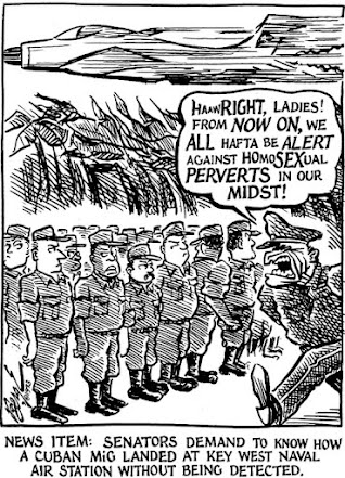 |
| in Gaze Magazine, Minneapolis, MN, Oct. 15, 1993 |
Very few of my cartoons here are like this one in portrait orientation, but that is how the layout editors of Gaze Magazine wanted them. My cartoons shared a page with three other panel cartoons, all drawn to approximately the same dimensions.
I drew pretty much the same cartoon for the UWM Post — the Post version drawn second, but published first. In accordance with the Post editorial page's layout, I drew the second version in landscape orientation. (Post editors in 1989 had asked me to draw my cartoons in portrait orientation for the three summer issues, but we reverted to landscape that fall.)
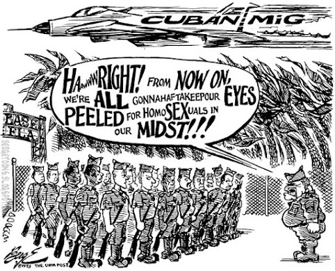 |
| in UWM Post, Milwaukee, Wis., Sept. 20, 1993 |
Which version do you think is more effective?
100 years ago, nearly all newspaper editorial cartoons appeared in portrait orientation. In some cases, the cartoon was nearly square (Daniel Fitzpatrick, for example), but portrait orientation dominated the medium for the first half of the 20th Century.
There were notable exceptions: Luther Bradley and his successor at the Chicago Daily News, Ted Brown, drew their cartoons in landscape orientation.
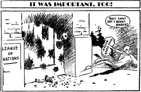 |
| "It Was Important, Too" by Ted Brown in Chicago Daily News, Sept., 1923 |
"The Royal Feast of Belshazzar Blaine" by Walt McDougall and Valerian Gribayedoff stretched across the front page of Joseph Pulitzer's New York World is another remarkable exception, as are the weekly cartoons Winsor McCay would produce to run atop William Randolph Hearst's syndicated Sunday sermons.
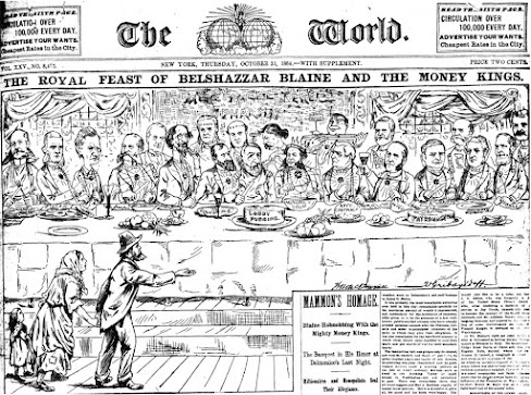 |
| "The Royal Feast of Belshazzar Blaine" by Walt McDougall & Valerian Gribayedoff in New York World, Oct. 31, 1884 |
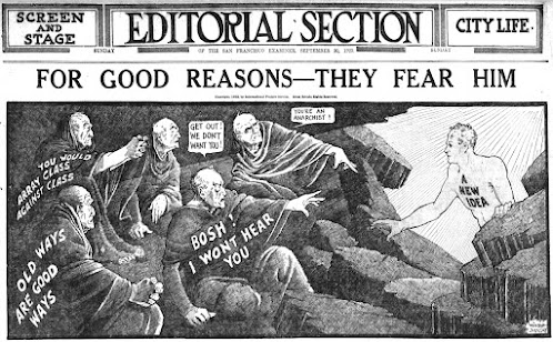 |
| "For Good Reasons They Fear Him" by Winsor McCay for International Feature Service, Sept. 30, 1923 |
John "Ding" Darling's cartoons for the Des Moines Register and New York Tribune hewed to the portrait standard...
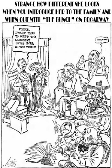 |
| "Strange How Different She Looks" by J.N. "Ding" Darling in Des Moines Register, Sept. 25, 1923 |
...but he oriented his cartoons for Colliers Weekly landscapewise.
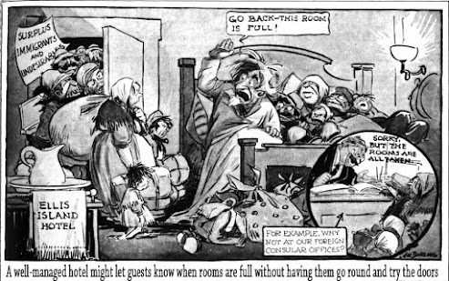 |
| "Ellis Island Hotel" by J.N. "Ding" Darling in Colliers Weekly, Oct. 6, 1923 |
When weekly magazines were the primary outlet for editorial cartoonists, the likes of Nast, Keppler, and Dalrymple would have a cartoon in portrait orientation on the front page and an epic two-page landscape cartoon as the centerfold. With a whole week to work on each cartoon, why not?
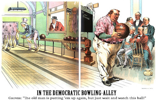 |
| "In the Democratic Bowling-Alley" by Victor Gillam in Judge, Sept. 30, 1893 |
Daily newspapers began to employ editorial cartoonists late in the 19th Century, fitting the cartoon in among multiple columns — breaking up the page rather than headlining it. Whether it was the shorter deadlines, the less sophisticated printing process, or just artistic preference, landscape orientation would remain relatively rare until the 1960's and '70's, with the rise of Gene Basset, Pat Oliphant, Jeff MacNelly, Don Wright, Mike Peters, (oh, I could go on and on), and those of us inspired by them.
As conglomerate newspaper management these days fails to see profit in printing editorial cartoons, the medium may have to return to portrait mode to accommodate editorial cartooning's future — the thing you are probably holding in your hand as you read this.
✍
Oh, by the way, since I asked: even though I still favor landscape mode for my own cartoons (and it's what my remaining editors expect of me), personally, I think the portrait oriented version of my Cuban MiG cartoon is the more visually satisfying.


